Brand Identity, Logo & Business Card Design
The Starting Point
Marago Construction came to me with an AI-generated logo concept and not much else. They knew they needed a brand that would feel just as comfortable on a homeowner's kitchen remodel as on a commercial job site, and they needed it ready before their web developer could start building the site.
Marago Construction came to me with an AI-generated logo concept and not much else. They knew they needed a brand that would feel just as comfortable on a homeowner's kitchen remodel as on a commercial job site, and they needed it ready before their web developer could start building the site.
The Approach
I kept the core idea they were drawn to and rebuilt it into something that could actually work as a brand. The AI concept had the right spirit but wasn't usable as a real logo, so I redrew it with cleaner forms and better proportions that hold up at any size, from a truck door to a favicon.
I kept the core idea they were drawn to and rebuilt it into something that could actually work as a brand. The AI concept had the right spirit but wasn't usable as a real logo, so I redrew it with cleaner forms and better proportions that hold up at any size, from a truck door to a favicon.
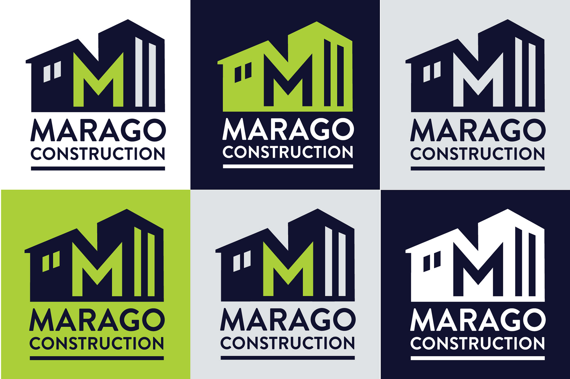
The M is built into the structure itself, with a home on one side and a commercial building on the other, showing both sides of Marago's work in a single mark.
Color Strategy
Marago originally wanted ocean blues. Before committing, I looked at other construction companies in their market and found many of them already using a similar teal blue. Going that direction would have made Marago blend in. Instead, I built the palette around Foundation Navy, which keeps the trust and stability of blue, and paired it with Hi-Vis Green to give the brand an energy none of their competitors had. Concrete Grey balances the two and keeps the brand grounded.
Marago originally wanted ocean blues. Before committing, I looked at other construction companies in their market and found many of them already using a similar teal blue. Going that direction would have made Marago blend in. Instead, I built the palette around Foundation Navy, which keeps the trust and stability of blue, and paired it with Hi-Vis Green to give the brand an energy none of their competitors had. Concrete Grey balances the two and keeps the brand grounded.
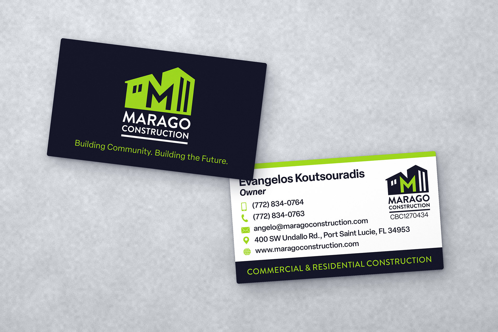
For the business card typography, I paired Brandon Grotesque with Elza, for a look that's strong and modern but easy to read.
What I Delivered
Final logo with alternate versions, a color palette with print and digital values, font selections, business card design, and a visual identity guide so their web developer had everything needed to build a consistent site.
Final logo with alternate versions, a color palette with print and digital values, font selections, business card design, and a visual identity guide so their web developer had everything needed to build a consistent site.
The Result
Marago went from an AI sketch to a complete, professional identity they could use everywhere. They were able to get the logo completed in time for the site developer, and now they're up and running. Check them out : maragoconstruction.com
Marago went from an AI sketch to a complete, professional identity they could use everywhere. They were able to get the logo completed in time for the site developer, and now they're up and running. Check them out : maragoconstruction.com